Automatic interactive plots for almost any netCDF file, plus publication-quality static figures with pub_plot.
Call plot() on a dataset for an automatic interactive plot, similar in spirit to the command-line tool ncview — but in Jupyter or a browser. Illustrated below with a sea-surface temperature dataset:
ds = nc.open_data("sst.mon.mean.nc")
ds.subset(year=2000)
ds.plot()
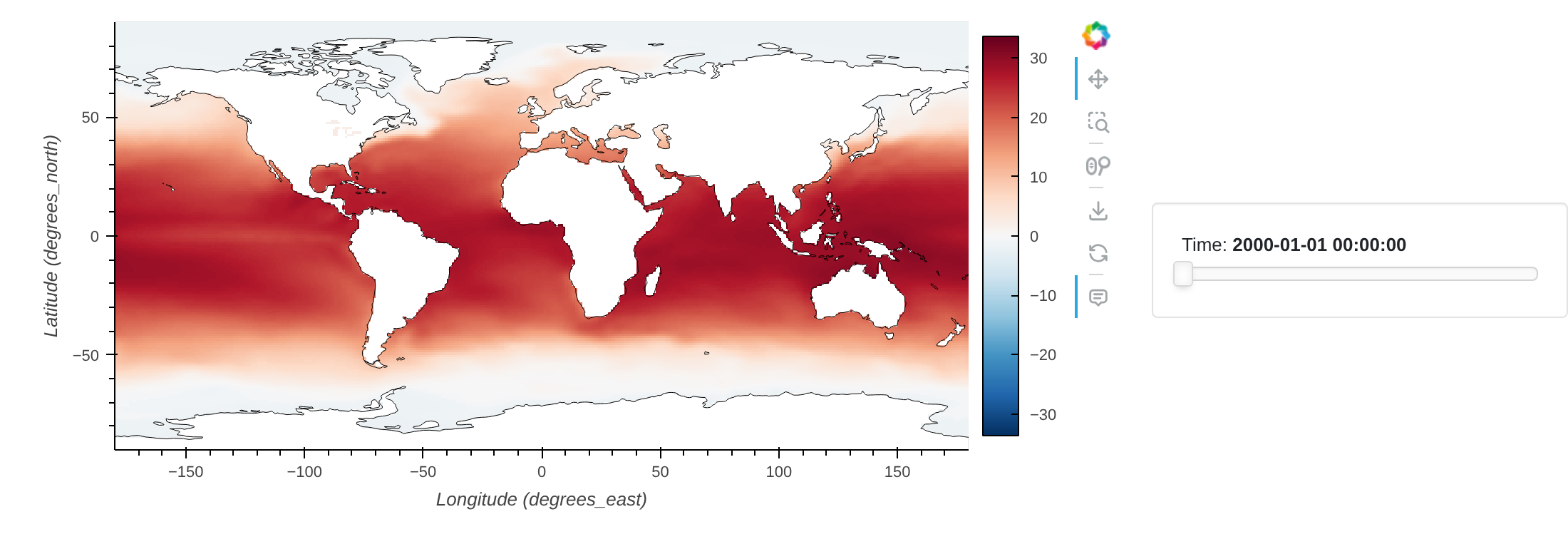
The plot type is chosen automatically from the shape of the data. A zonal mean gives a zonal profile:
ds = nc.open_data("sst.mon.mean.nc")
ds.subset(year=2000)
ds.tmean()
ds.zonal_mean()
ds.plot()          # zonal profile
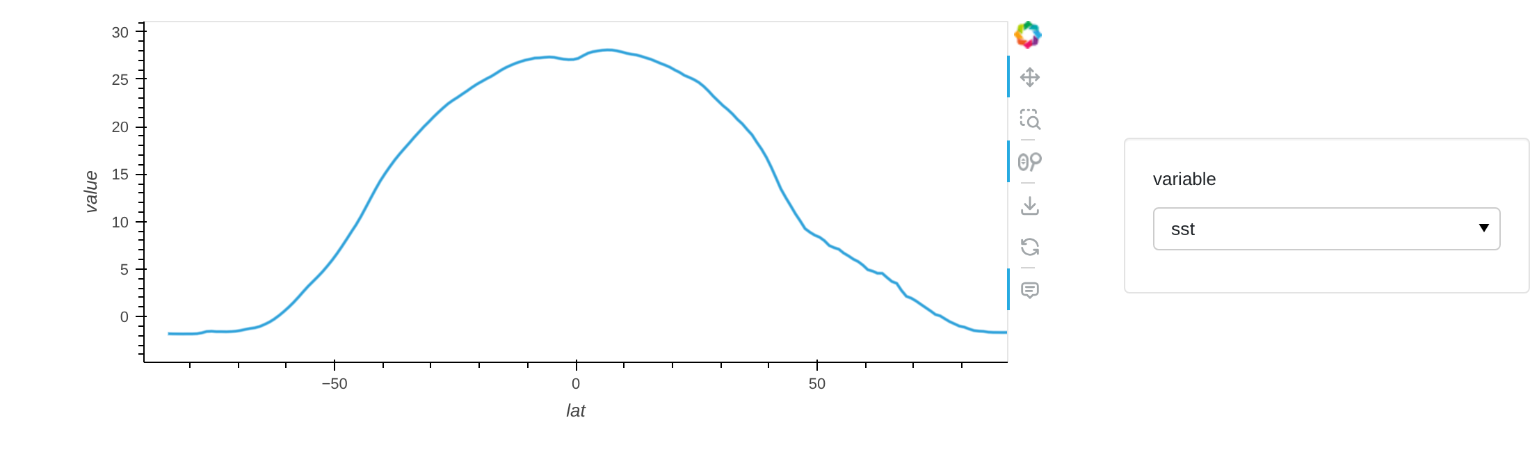
A zonal mean tracked over time renders as a Hovmöller-style heatmap — here, the change in zonal-mean temperature relative to an 1850–1869 baseline:
ds = nc.open_data("sst.mon.mean.nc")
ds.zonal_mean()
ds.annual_anomaly(baseline=[1850, 1869], window=20)
ds.plot()
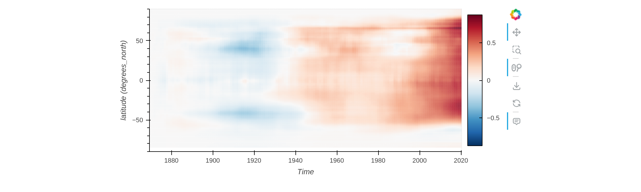
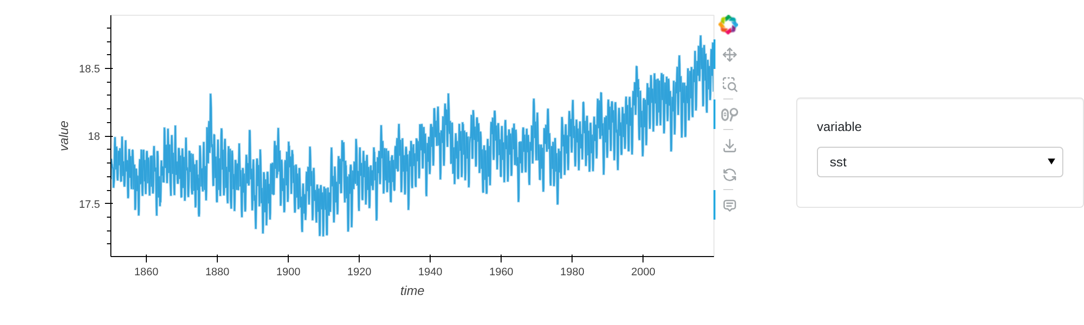
Once the data has a single spatial value per time step (e.g. after spatial_mean()), it plots as a time series — here, global mean sea surface temperature since 1850:
ds = nc.open_data("sst.mon.mean.nc")
ds.spatial_mean()
ds.plot()          # time series
pub_plot (introduced in v0.9.2) produces a static plot suitable for a paper or presentation, currently restricted to regular lon/lat grids with a limited set of customizations (such as the colour scale):
ds.tmean()
ds.pub_plot()
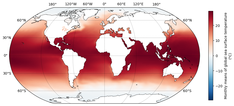
Interactive plotting is delegated to the companion ncplot package, which inspects the dataset and picks a suitable plot built on hvplot. It favours rapid exploratory analysis over deep customization, but most hvplot customization options — title, logz, clim, and so on — can be passed straight to plot() and are forwarded automatically.